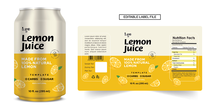
Walk down any aisle and you’re not merely shopping. You’re being surrounded, spoken to, and seduced by color, typography, and form. Every box, bottle, and pouch whispers a promise, a story condensed into seconds. And in that fleeting moment, before logic can interfere, your eyes decide what your hands will reach for.
This sort of instant recognition and silent persuasion is the power of product packaging design, It’s not just containment. It’s a conversation, and the first handshake.
The Three-Second Rule
Three seconds is all the time a product gets before the next one steals the spotlight. The shelf is a battlefield, and product packaging design is your armor. Bold hues that break monotony. Shapes that disrupt symmetry. Fonts that declare rather than suggest.
Consumers don’t browse they scan. Their eyes glide like searchlights, locking onto what feels intentional. The difference between a design that pauses the scroll or shelf glance and one that fades into the blur is brutal but simple: clarity meets personality.
A well-crafted design doesn’t shout. It signals. The difference is everything.
Visual Language and Emotional Trust
Once you’ve earned that glance, the conversation deepens. The package must answer questions before they’re even formed: What is this? Who made it? Can I trust it?
And product packaging design does all this without a word.
A luxury serum needs to be designed in a frosted glass package and serif lettering, showcasing exclusivity. While a protein bar would have a package where the health icons are predominantly displayed for better product understanding.
This is silent storytelling at its finest. You’re not selling just a product. You’re selling a feeling of certainty. A sense that the person behind the package understands your life, your values, and your rhythm. Trust begins before purchase, and packaging is where it’s born.
The Psychology Behind Color and Shape
Design reaches deeper than aesthetical aspects, as it could even rewire the perception of the audience. The psychology of product packaging design works using various emotions associated with specific colors and shapes.
Color speaks before text does, as red creates urgency and appetite. Blue feels clean and dependable. Green breathes life, calm, and health. Black, meanwhile, leans into elegance and strength.
Shape tells its own story. A slim glass bottle? Precision. A stout jar? Generosity. The touch of a matte finish versus a glossy one can alter perceived quality in milliseconds. Weight too—products that feel heavier are often assumed to be premium. The mind, it seems, trusts gravity.
Every curve, edge, and contour participates in persuasion. Nothing is accidental. Every element in product packaging design works like a cue in a conversation you don’t realize you’re having.
Information as Design, Design as Information
After the attraction phase comes validation, and this is where clarity steps in. No one wants a guessing game at the shelf.
Great product packaging design guides the eye through a hierarchy of information. The logo claims identity. The tagline extends it. Benefits appear boldly, nutritional facts are clean and legible, and features like “eco-friendly,” “sugar-free,” and “new and improved” find their rightful emphasis.
Appeal to Cart Conversion
The reach, the lift, and finally the purchase. That’s the final test of design’s invisible hand. Everything, from typography to tactile feel, contributes to that micro-decision.
The package that wins is the one that performs this quiet choreography: attract, inform, assure, convert.
And in the digital era, this influence extends far beyond physical shelves. Product packaging design must now shine in thumbnails, look persuasive in pixelated grids, and survive the scrutiny of zoomed-in product pages.
Sustainability: The New Luxury
Today’s consumers look far beyond the aesthetics of the packaging, as they also want to know what it is made up of. This sort of sustainability is a moral shift that in turn affects the product packaging, which is made out of recycled and sustainable materials with lower carbon emissions.
Modern product packaging design must balance environmental mindfulness with aesthetic finesse. Cardboard can be chic. Kraft textures can feel upscale. Sustainable doesn’t mean stripped-down; it means thoughtfully constructed.
This evolution has turned eco-consciousness into an aesthetic language of its own, one that says, We care. This sort of message, subtle but powerful, is increasingly shaping purchase decisions.
More Than a Box
Let’s be clear: a package is never just a box, it’s a miniature billboard. A piece of strategy disguised as simplicity. A silent salesperson standing on the front lines of consumer choice.
Investing in Product Packaging Design is vital as it is the difference between a product that sits and one that sells, between a glance and a grasp. In a marketplace defined by milliseconds of attention and endless options, design doesn’t follow the sale it creates it.
Bring Your Packaging Vision to Life with Honeycomb
Your product deserves more than generic packaging; it deserves Honeycomb. We merge storytelling, strategy, and design into packaging that takes into consideration everything from first glance to final purchase.
Partner with Honeycomb, where design meets impact.


